A better match

This post is about new mitts, and the story behind them.  Because one should always start with the pretty, here are the mitts:

2-IMG_9934

And here is the story.

A few weeks ago, I wrote a post about a mismatch of pattern and yarn.  I had a skein of Madelinetosh DK left over from another project and decided to knit a pair of mitts.  The yarn is lovely, very soft and warm, and the colour, Composition Book Grey, is one of my favorites.  I picked a lovely mitt pattern called Masonry Mitts by Vera Brosgol.  Here is the pattern photo:

copyright verabee

copyright verabee

And here is my attempt to knit it up with the Madtosh:

1-IMG_9873

I really didn’t feel like this was working; in fact, it was pretty clear to me almost from the beginning that it wasn’t going to work but I stuck with it for a while.  Leah, who writes this lovely knitting blog, left a comment on my post, in which she says: “It is amazing how the wrong yarn can make such a huge difference in even such a small project as mitts. Good for you for not trying to force the yarn on the project. ”  This comment made me think about what exactly was wrong with this yarn-pattern pairing – it also made me realize that there are other people out there who think about things like this.  So, for those of you who care about such things, I will discuss it further here.  For the rest of you, feel free to look at the pretty photos and ignore those pesky words.

The Masonry mitts are designed to be knit with Cascade 220, which is a plied yarn with a tight twist; it is a sturdy yarn, what we call a “workhouse yarn”.  The Madtosh is a soft, fluffy, un-plied yarn which is very splitty.  Cascade 220 could be described as architectural – it will keep its shape.  It has substance.  The Madtosh is lovely and light and unformed; if left to its own devices it will flop.  When I tried to knit the Masonry knits with the Madtosh, there wasn’t enough structure to hold the shape.  I could have attempted to mitigate this by knitting with a much smaller needle and forcing a tighter fabric.  However, another design mismatch was also at play here.

The Masonry mitts have vertical columns of garter stitch and stockinette stitch.  Most knitters get different row gauges with the two stitches.  This means that one half of the mitt (the stockinette portion) will end up measurably longer than the other half (the garter portion).  Garter rows are tighter and pull the fabric together vertically.  If you are using a yarn with a tight ply and a good twist, this will still happen, but it will be less obvious and more amenable to blocking.

I frogged the mis-begotten mitt (this means I ripped it out so the yarn could be recycled into another project) and decided to try again with the pattern Toast and Jam, designed by Emily Foden.  Toast and Jam also juxtaposes garter and stockinette (I guess I was finding this an attractive theme), but it does it in a smaller portion and over a field that is increasing rather than a straight vertical section.  This keeps the mismatched gauges from getting too out of control.  Not entirely, though, as you can see from the unblocked Toast and Jam mitts, where the row gauge of the garter section is clearly tighter:

1-IMG_9930

A good blocking fixed this problem.  The main advantage of this pattern over the Masonry pattern, with respect to the Madtosh DK, is that the Toast and Jam Mitts are knit almost entirely in Twisted Rib.  The twisted rib pulls in the knitting and keeps tight control on the otherwise unplied Madtosh; in other words, it gives it structure and keeps it tight.  It doesn’t hurt that it is knit with a 3.5mm needle (a US 4) instead of the 4mm (US 6) that I was knitting the Masonry mitt with.  I knit Leah’s beautiful cardigan with the Madtosh and it has flow and drape – it doesn’t need a tight gauge and a twisted rib.  But a Mitt takes a lot of punishment – it doesn’t need flow and drape, it needs structure.

One of the lovely features of the Toast and Jam pattern is that the garter stitch portion can be worn on the outside of the hand, or on the palm.  Here it is on the outside:

6-IMG_9948

And here it is on the palm:

4-IMG_9953

The next time that you are considering substituting a different yarn for the one the pattern calls for, think carefully.  What are the charicteristics of the fabric you want to create?  How is it going to be worn?  Does it need to be sturdy or delicate?  Are you looking for structure or flow? And what are the characteristics of the yarn?  Once you think you have a match – go for it, be creative, that’s what make knitting fun!  And when you can see that you’ve got it wrong, don’t be afraid to stop.  Rip it out and try again.  Then, you’ll have a match made in heaven.

3-IMG_9946

Hello, Arleen

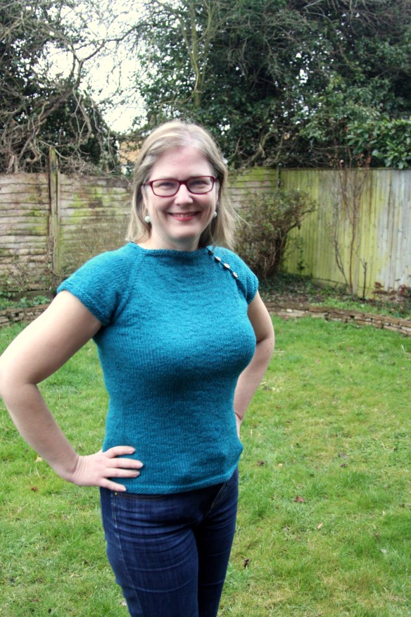
In this recent post, called “Goodbye, Levenwick”, I showed photos of my poor, departed Levenwick cardigan.  Despite my love for the pattern, it didn’t fit, it looked sloppy, the fabric bunched and I never wore it.  When I discovered a moth hole in it, I took my scissors and started to rip.  Well, it’s Goodbye Levenwick….Hello Arleen:

IMG_6212Arleen is a simple T-shirt pattern designed by Dona Knits (Ravelry link here).  I was in the mood for a fast, simple knit and this fit the bill.  I didn’t even have to knit a gauge swatch since it has the same gauge as Levenwick, so as soon as I finished ripping, I cast on and started knitting.

IMG_6209Arleen is a top-down raglan, knit in the round.  I made three small modifications.  FIrst, I didn’t like the way the pattern makes the raglan increases (with a kfb, kbf), so I used M1, k1, slip marker, k1, m1.   This makes a much neater raglan, at least for me.  Second, the pattern says to start waist decreases at 7 inches after the sleeve separation.  I don’t know about you, but I am considerably higher waisted than that; I started the waist decreases at 4″.  Then, I made an extra set of waist decreases, offset by an extra set of hip increases.  This makes a lovely, shapely sweater, that is not too fitted.

IMG_6197This T-shirt took me 12 days from start to finish, including blocking.  I am sure there are knitters out there who could whip it out in a couple of days.  If you are looking for something fast, cute and comfortable, this definitely fits the bill.  (Another plus, the pattern is available for free.)

However, the very best thing about this sweater is that it perfectly matches my Stripe Study Shawl:

IMG_6220

This shawl was the topic of my very first blog post in October 2011.  It was desiged by the talented Veera Välimäki.  I knit it with two skeins of Wollweise “Pure” 100% Merino Superwash.  I don’t seem to have recorded the colour of the brown, but the blue is called “Aquarius” and is an astoundingly good match for the Cascade 220 in colour 2433 with which I knit Arleen.

IMG_6226I think I will get a lot more use out of this than I did out of Levenwick.  In fact, since I finished it, I keep thinking of making another one, say in black, and maybe a red one, and fuschia would look good, perhaps emerald, oh I know, rust, or navy,  maybe charcoal……..

IMG_6201

Goodbye, Levenwick

I have been trying to decide for some time which of my knits to feature in my next Wearability Wednesday post.  In the WW series, I re-visit a garment I’ve knitted and examine it in terms of wearability.  I try to address the questions:  Do I actually wear it?  If so, how do I style it?  What do I wear it with?  Do I dress it up or down?  If it doesn’t get worn, then why not?  What doesn’t work about it?  Is it a fit issue, or just a poor choice in garment style?

I finally decided to focus this week on Levenwick, a design by Gudrun Johnston for Brooklyn Tweed; published in BT’s Wool People, vol. 1.   Here is the pattern photo for Levenwick:

copyright Jared Flood/Brooklyn Tweed

copyright Jared Flood/Brooklyn Tweed

I instantly loved this pattern (though I hate the headscarf).  I was certainly not the only one.  Levenwick has proved to be very popular.  Interestingly, when I look at my blog statistics, one of the most frequently used search terms is Levenwick; a lot of knitters are clearly interested in the pattern.  (Levenwick is also the name of a small village in Shetland, but I imagine most of those searching for it are looking for the cardigan.  Maybe that’s knitting-centric of me?)

I knit Levenwick in September and October of 2011.  I used Cascade 220 in a very pretty teal.  I have written a number of posts about Levenwick, which can be found here (this will link to all the Levenwick posts, including this one, scroll down to read the older ones).  Here is one of the photos we took when it was first finished:

IMG_0118Emma took this photo, and I really like it.  I love the way it looks against the peeling wall and I especially love the contraposition of the teal and the rust.  You can see that the Cascade looks great, the stitches beautiful and uniform.  But you can also see that the fit is not good.  The whole area around the shoulders and yoke is awful and the fabric bunches.  You can imagine, with Emma in charge of the photo, that this is as good as Levenwick ever looked on me.  This photo is the result of Emma adjusting and pulling and re-adjusting, and me not moving.  As soon as I move, even the slightest bit, the bunching looks worse.

Knowing what I do now about the fit issues I had with Levenwick, I can see some of it in the pattern photo.  Though not as pronounced as mine, you can see the fabric bubbling under the model’s chin.  I still think the pattern is lovely, and many knitters have made great-fitting versions of Levenwick.  However, try as I might, I found my version of this cardigan to be pretty unwearable.

Now, when I wasn’t holding completely still and pulling the sweater into place just so, the poor fit became even more pronounced:

IMG_3535The above photo was taken in the stands at the Olympics (a fabulous day watching the rowing).  You can see how happy I was to be there.    You can also see that this sweater doesn’t fit at all.  It just doesn’t.

Here’s another photo, from the same day, taken from a different angle (and yes, that is me, knitting at the Olympcs – Score!):

IMG_3704

Let’s face facts: it doesn’t fit.  I tried to wear it, I really did.  I tried it buttoned all the way up.  I tried just buttoning the top buttons.  I tried just buttoning the bottom buttons.  I tried leaving it open (a real no-no).  I am usually good at knitting a garment that will fit properly.  One of the problems with the fit is that the pattern starts by knitting a long strip of lace for the collar and then picks up stitches and knits down.  The collar, however, is really too wide, so no amount of adjusting the pattern as you knit is going to make it fit.  The only way I could have gotten a better fit was to rip the whole thing out and start over with a much narrower strip of lace.  In addition, the raglan sleeve increases just didn’t work out at all.  This could result from my gauge rather than the pattern; my stitch gauge was spot on but my row gauge was off.  Raglan decreases are one of those areas where the right row gauge is essential.

On Saturday morning, I finished knitting Leah’s February scarf and blocked it.  Afterwards, I decided to grab my Levenwick and take some more photos in preparation for writing this post.   This is what I found:

IMG_6115A moth hole!  Holey moley!  (Pun intended.)  Now, I could probably fix this.  But, I rationalized, why fix the hole when I’m not going to wear the sweater?  And before you could say “Goodbye, Levenwick” I had the scissors out and started cutting.

IMG_6164

This sweater took a very long time to frog.  Because of the way it’s constructed, frogging was not straightforward.  I put on my headphones and listened to an audiobook (Shards of Honor by Lois McMaster Bujold; very enjoyable start to the Vorkosigan series) and spent hours steadily ripping it out.  (Frogging, by the way, is the highly technical term we knitters use to denote ripping out your knitting. I have been told it’s because you “Rip it! Rip it!” – which sounds like the English word for what frogs say.)

I no sooner finished frogging, then I grabbed some needles and started to knit.  I didn’t even take the time to steam out the kinks in the yarn.  (The knitting thus looks pretty uneven but I am fairly certain it will steam out when I block it.)  And what, you may ask, am I knitting?  Well, you will have to stay tuned to this spot to find out.

IMG_6168

Anatomy of a design

My daughter Leah is into medieval history in a big way.  For a long time we have been discussing designing a sweater based on medieval motifs.  Leah and I thought that we had come up with an interesting design for a bottom-up yoked pullover with some Anglo-Saxon text worked across the yoke.  We spent a long time discussing texts, colour schemes, yarn choices, etc.  We also discussed shaping and style.  We had picked out a nice, deep red for the body of the pullover, and planned to make the text in a brown wool on a parchment-coloured background in a circle around the yoke.

As an aside to this discussion, Leah asked me whether we could work a small pattern into the pullover, around the neck and sleeves, in gold and red.  She was inspired by Anglo-Saxon jewellery.

The above piece was buried with an Anglo-Saxon princess over 1300 years ago.  This photo, along with a brief description, is from the BBC, A History of the World – an online archive of objects from the British Museum, which you can find here.  Here is another example, the Canterbury Pendant, also Anglo-Saxon, circa the early 7th century.

This type of cloisonné work, using garnet and gold, was popular in the period.  The above photo, can be found, along with a description of this piece, on the webpages of the World Gold Council, here.  If you run a search for Anglo-Saxon jewellery, or for Early Middle Ages jewellery, you will find many such pieces.

Leah asked if we could try to recreate the look of this technique for a narrow colour band around the neckline and cuffs of the pullover.  We searched for some appropriate yarn.  I wanted to use Cascade 220 for this pullover, and we found what we thought would be the perfect colours, which we ordered from Get Knitted in Bristol (along with the brown and parchment colours for the text planned for the yoke).

As they didn’t have all colours I wanted in stock, I waited a few weeks for the delivery.  (They have very nice customer service, by the way.) In the meantime, I had these pictures of Anglo-Saxon jewellery fermenting in the back of my brain.  One day, while rooting around Ravelry (my favorite occupation), I came upon a pattern for a pair of mittens, called Frank, designed by Lauren Osborne.  The Ravelry link is here.

I don’t know why, but as soon as I saw these, they reminded me of the medieval jewels.  I reasoned that one repeat of the design, knit in gold and red, would have much of the same feel as the jewellery I was trying to replicate.  My yarn arrived, and one night, while Doug and Leah sat watching a movie, I cast on a swatch and knit one pattern repeat from the Frank mitten pattern.

Isn’t that great?  Leah and I both fell in love with it.  It wasn’t, however, appropriate to our original conceptions of the pullover design.  The  cloisonné pattern was intended to form a very narrow ring near the neckline, just to add a bit of colour and flair to the main design element, which was intended to incorporate text from a medieval manuscript. This pattern repeat is 25 rows long, and coupled with the width of the Cascade 220 (a worsted weight wool), the resulting pattern was too wide.

However, the more we looked at it, the more we loved it.  Leah and I decided to put aside the medieval manuscript idea for the moment, and knit a pullover based on this pattern repeat, with the inspiration of the Anglo-Saxon jewellery in our heads.  Now we had a lovely band of colourwork, the yarn, but no sweater design.  The original idea, for a yoked pullover, didn’t mesh with this swatch. (The pattern knit in this wool is about 4 inches wide.  I didn’t see how I could incorporate a 4 inch pattern into a yoke without having decreases as an integral part of the pattern.  Furthermore, I didn’t feel as if the yoke was the appropriate placement for this pattern.)  I was left with two options; one, to design a pullover from scratch to incorporate this pattern, or two, to find a pullover design which I liked, into which I could incorporate this band of colourwork.  Again, Ravelry came to the rescue.

I had a pullover in my queue on Ravelry, which had been there for a very long time, always with the intent to make it some day for Leah.  It is the Astoria pullover designed by Marnie MacLean (Ravelry link here).  Here is a photo:

I love the shape of this and, once I started thinking about it, I couldn’t stop imagining it in deep red, with the gold and red pattern from the Frank mittens in place of the colourwork band.  Interestingly, just as I cast on for this project, Blair – one of the readers of this blog, who is a fabulous knitter and great blogger, posted her Astoria pullover.  Her blog, Blairistan, is great; go read it.  She and I have such similar tastes in sweaters, it is uncanny.

So began Leah’s Medieval Gems pullover. There ensued a lot of math (some of which will be described in the next post) and some knitting, and some ripping, and some re-knitting (some of which will also be described in the next post).

This was followed by some general admiration and photo-taking:

and also much fitting and refitting:

Since these photos were taken last weekend, I have ripped out and reknit the neckline, and am now considering re-ripping and re-re-knitting the neckline.  I have also knit down to the waist, and am about to rip and re-knit down to the waist, adding more waist decreases.  Despite all of the fiddling, both Leah and I are thrilled with how this one is developing.  This has been the anatomy of a design; stay tuned for the rest of the story.